What Moving Into a New Apartment Taught Me About Web Design
When I google "UI design guidelines", I get well-written articles all about creating UIs that are easily understood by users and accessible to everyone. Why would I ever want that? What I really need is someone to teach me how to make UIs that don't look like dog crap.
There is no guide on how to make good-looking UIs. Established designers commonly recommend "practice and iterate to develop good taste"... but this is not helpful and clearly their way of gatekeeping their occupation.
I recently moved from New York to San Francisco and left everything behind and I've been absolutely crushed by the idea of furnishing my apartment. For the first time in my life, I will have absolute creative control over the space I occupy. Also for the first time in my life, I've been faced with Gen Z's worst nightmare: if it doesn't turn out well I won't be able to blame my parents.
I've been binging sassy interior design youtubers (1) (2) so I could educate myself and refine my taste. They often analyze one visual design concept that is never thought about in web design -- texture.
Visually interesting designs are created by varying texturesIn the natural world, you have to consider texture because all physical objected inherently have texture. Wood, linen, wicker, plastic, copper, wool, plant leaves, terracotta, leather. Everything. Has. Texture.
Take, for instance, Kim Kardashian's infamous minimalist mansion that's accredited with singlehandedly killing the minimalist trend.
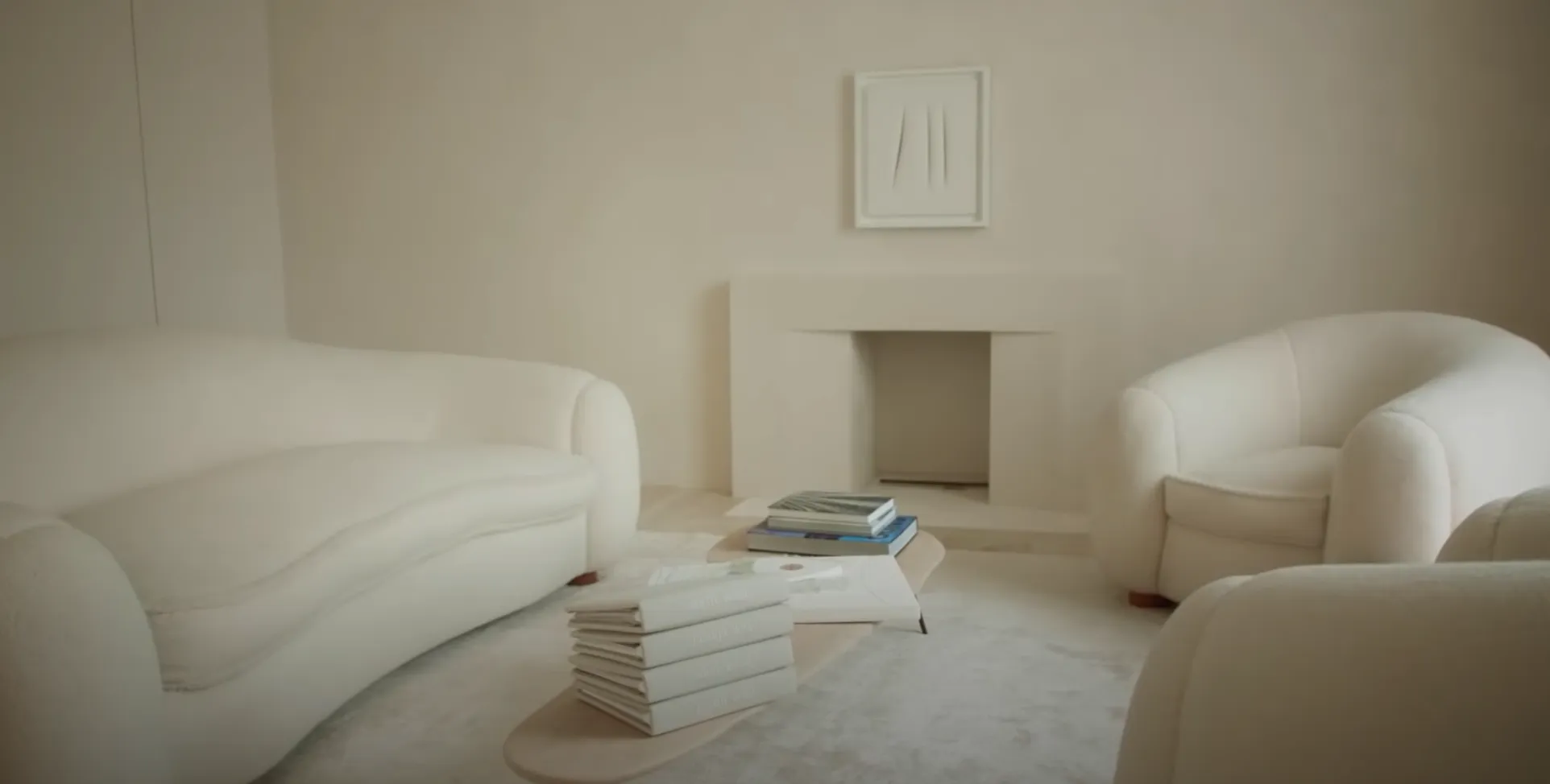
Say what you will about Kim K but she has the money for a fantastic designer. The theme of this mansion is that everything is in very, very neutral colors in order to create a calming environment. This could have gone terrible very easily and ended up looking like a sterile alien environment. In the room in theimage, I think her couches and rug are what really make the space -- and not just because the each couch costs more than a house. Despite them both being matte white, there's a subtle difference between how light diffuses off of the walls and the couches which creates enough contrast to make it look decent. While the rug is actually solid white, the way the fuzz is messed up a little gives the rug a bit of an interesting texture which adds a lot to the room.
In the digital realm where objects are by default constructed from flat vector graphics, discussion around design is often limited to color theory, form, and function. This might be a product of contemporary design philisophy which is obsessed with creating beauty from functional form and being honest to the materials crafted with (see Apple).
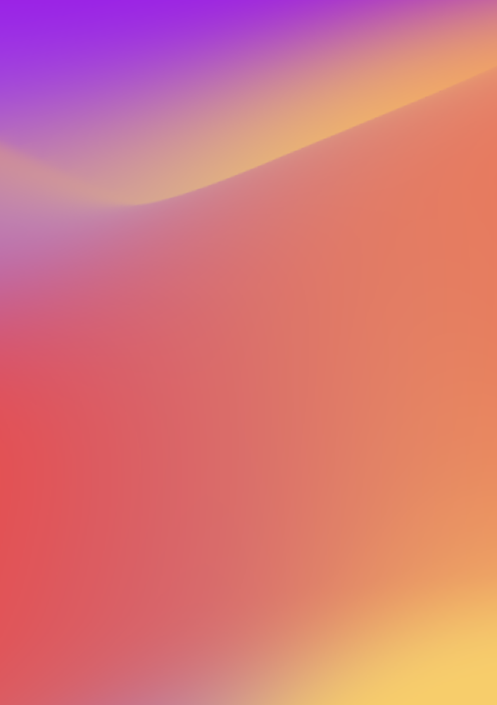
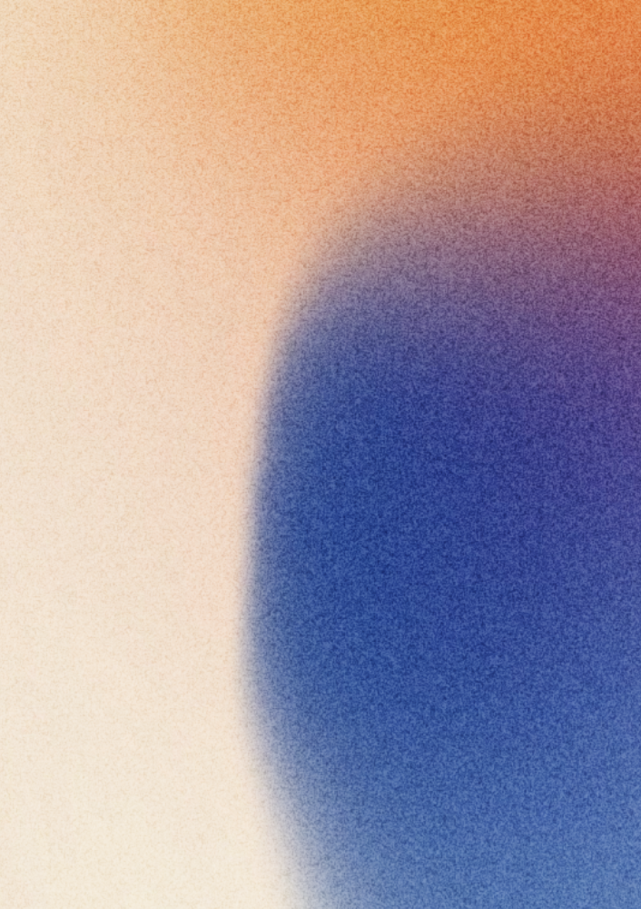
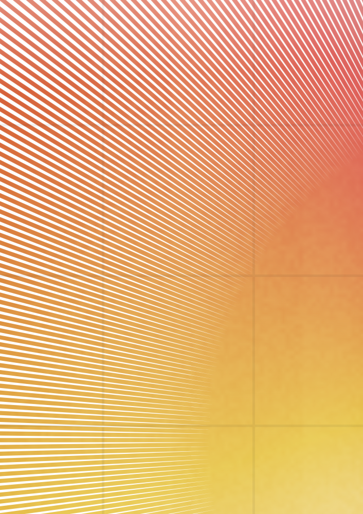
Web designers manipulate texture through proxies such as typography, visual hierarchy, UI density, images, and gradients.Gradients primarily create visually interesting designs due to their colorful nature, but if you look closer at the best gradients, you can clearly see that they are layed with interesting textures.
Textures can even be created in text-only designs. A rather extreme example of this is a newspaper. The blocks of text with different fonts, sizes, and weights almost resembles a quilt of words.

A bit of a meta point, but the callouts placed within this blog post are designed to break up the large walls of text and create visual interest.